Modifying graphs and adjusting the charts is a great way to visualise the data exactly how you want to, and by doing so get better insight into your data. The various charts found within Fyr have various options.
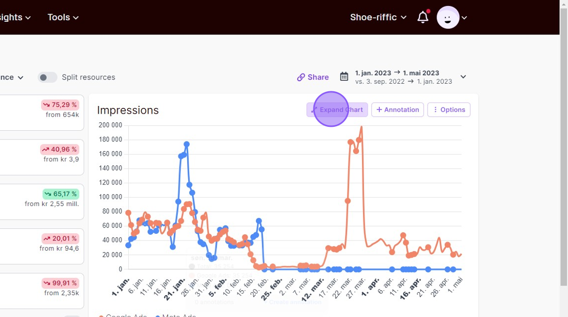
In this document we’ve used the chart in the Marketing Performance report as an example.
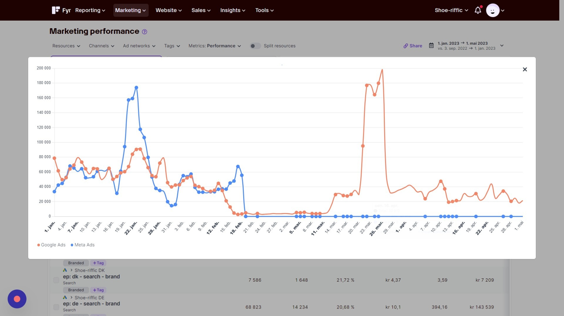
You can expand the chart and view it in a modal by clicking the “Expand Chart” button.
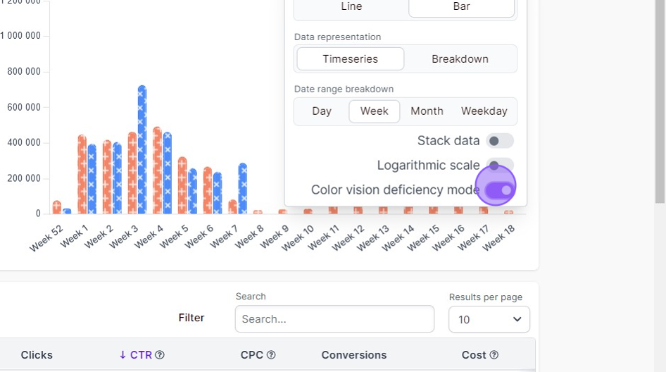
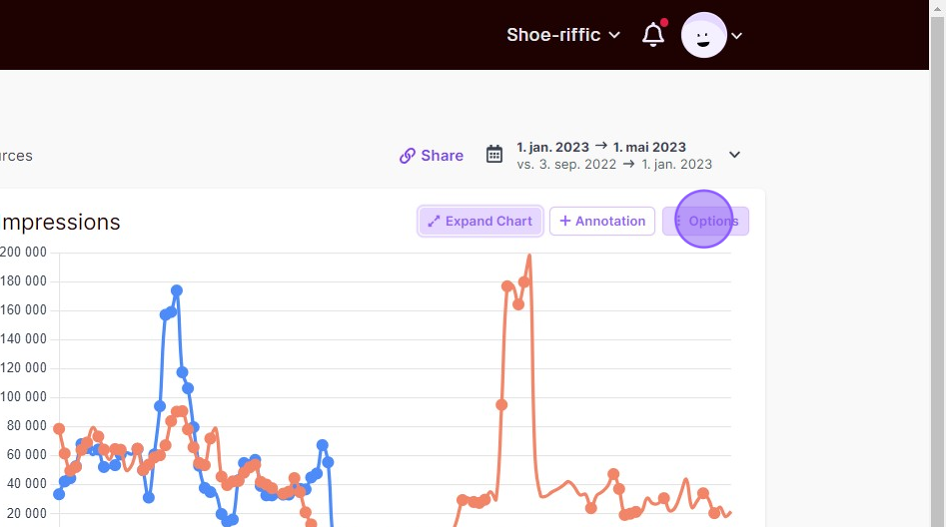
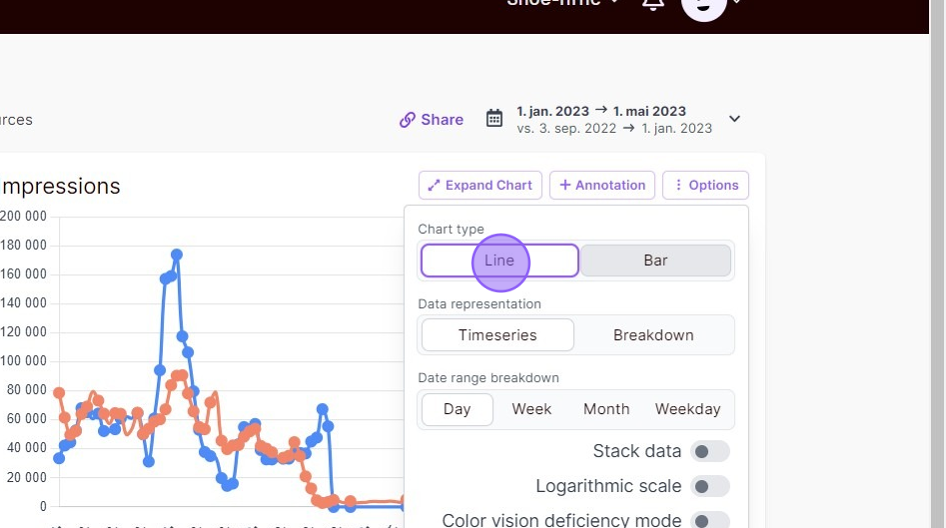
Other options for the chart is displayed when you click the “Options” button.
You can choose between a line graph or a bar chart.
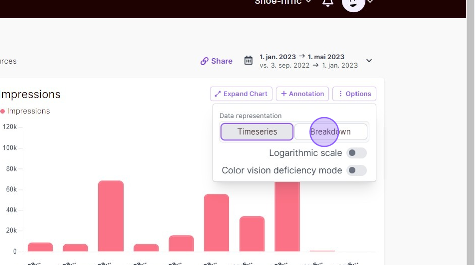
If you want to see a breakdown of your data instead of a timeseries, you can select this as the option.
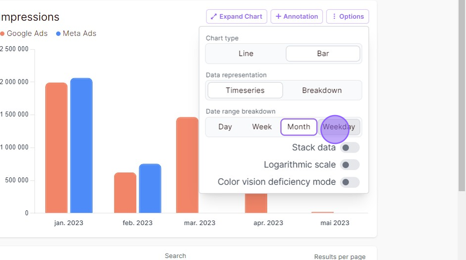
Choose between a breakdown on days, weeks, months or weekdays. The standard breakdown in Fyr is “Day”.
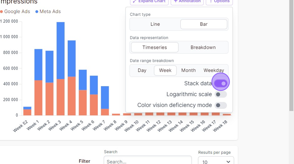
Toggle “Stack data” to stack your data in the chart.
If you want display your data in a more compact way, as opposed to the standard linear number line, you can toggle our option “Logarithmic scale”.
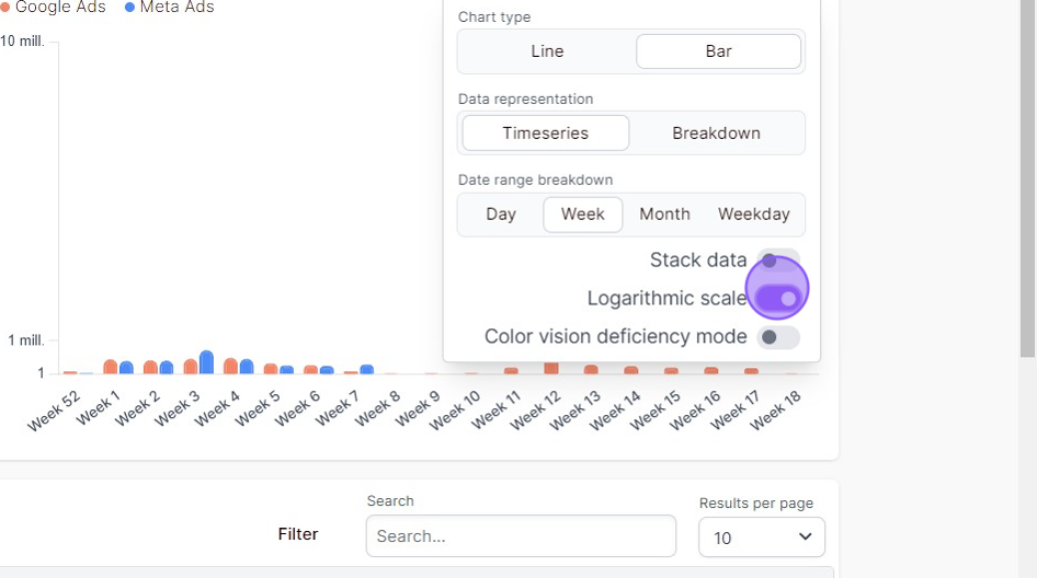
We also support color vision deficiency mode. If you have color vision deficiency, we highly recommend toggling this option to easy distinguish between the data sets you’re looking at.